An interactive review of Oklab
Update 2021-01-29: See the update below for more color spaces and discussion.
Björn Ottosson recenty published a blog post introducing Oklab. The blog claimed that Oklab is a better perceptual color space than what came before. It piqued my interest, and I wanted to see for myself.
In exploring perceptual color spaces, I find an interactive gradient tool to be invaluable, so I’ve reproduced one here:
Show more color spaces (added after the initial publication of the article, for further comparisons)
Why (and when) a perceptual color space?
Most image processing is done using a device color space (most often sRGB), and most libraries and interfaces expose that color space. Even when an image editing tool or a standard (such as CSS) exposes other color spaces, it’s still most common to use the device color space. But for some use cases, a perceptual color space can give better results.
Basically the central question of color theory is how colors (in the physical sense) are perceived. The trichromacy assumption basically groups colors into equivalence classes in a three-dimensional space, and display devices generally produce colors by mixing three additive primaries: the familiar red, green, and blue.
In an ideal perceptual color space, the distance of two points in the space would correlate strongly with the perception of color difference. Put another way, all pairs separated by a “just noticeable difference” would be separated by an equal distance.
As it turns out, such a thing is no more possible than flattening an orange peel, because color perception is inherently non-Euclidean. To put it another way, the ratio of perceptually distinct steps around a hue circle to those directly across through gray is greater than would be expected as a circle in an ordinary Euclidean space.
Even so, like map projections, it is possible to make a color space that approximates perceptual uniformity and is useful for various tasks. One of these, a primary focus of this blog post, is smoother gradients.
Gradients are of course very similar to color scales, and a good perceptual color space can be used as the basis for those. An even better approach is to use a real color appearance model, as was done in A Better Default Colormap for Matplotlib, and is well explained and motivated in that video (it contains a brief introduction to color science as well).
A major application of perceptual color spaces is image manipulation, especially changing the color saturation of an image. This is a particular place where hue uniformity is important, as you don’t want hues to shift. Also, prediction of lightness is especially important when transforming a color image to black and white.
Perceptual color spaces are also a good basis for programmatic manipulation of color palettes, for example to create sets of colors in particular relation to each other, or to derive one of dark and light mode from the other. For example, the normal/hover/active/disabled states of a button may be different lightness and saturation values of the same hue, so hue shift would be undesirable. In particular, I think a future evolution of the standard Blend modes should have at least the option to do the blending in a high quality perceptual color space.
And, as mentioned by Björn, a color picker widget can benefit from a good perceptual space. It should be possible to adjust lightness and saturation without affecting hue, in particular.
Much of the literature on perceptual color spaces is geared to image compression, with two primary motivations. First, as compression adds errors, you generally want those errors distributed evenly in perceptual space; it wouldn’t be good at all to have artifacts that appear more prominently in areas of a particular shade. Second, good compression depends on a clean separation of lightness and chroma information, as the latter can be compressed better.
All that said, there are definitely cases where you do not want to use a perceptual space. Generally for image filtering, antialiasing, and alpha compositing, you want to use a linear space (though there are subtleties here). And there are even some cases you want to use a device space, as the device gamut is usually nice cube there, while it has quite the complex shape in other color spaces.
Focus on gradients
This blog post will use gradients as the primary lens to study perceptual color spaces. They are a very sensitive instrument for certain flaws (especially lack of hue uniformity), and a useful goal in and of itself.
No one true gamma
The transfer function for neutral colors is the literal backbone of any color space. Commonly referred to as “gamma,” it is one of the most commonly misunderstood topics in computer graphics. Poynton’s thesis is a definitive account, and I refer the interested reader there, but will try to summarize the main points.
An ideal transfer function for gradients will have perceptually equal steps from black to white. In general, the transfer function in CIELAB is considered close to perceptually uniform, but as always in color perception, the truth is a bit more complicated.
In particular, perception depends on viewing conditions. That includes the ambient light, but also the surround; the same gradient surrounded by white will appear darker than when surrounded by black. For an extremely compelling demonstration of the power of surround to affect the perception of lightness, see Akiyoshi’s illusion pages, for example this one.
Another complication is that the light received by the eye includes so-called “veiling glare,” a fraction of ambient light reflected by the monitor because its black is not a perfect absorber (veiling glare is much less of a problem in movie-like conditions).
The actual CIELAB transfer function is not a perfect cube-root rule, but rather contains a linear segment in the near-black region (the sRGB transfer function is similar but has different parameters). This segment increases perceptual uniformity of ramps in the presence of veiling glare, and also makes the transform robustly invertible using lookup tables.
There is good science on how perception varies with viewing conditions, and the CIECAM color appearance model has parameters that can fine-tune it when these are known. But in practice, viewing conditions are not known, and the best approach is to adopt a best guess or compromise.
HDR
HDR is a different story, and I need to go into it to explain the ICtCp color space.
In standard dynamic range, you basically assume the visual system is adapted to a particular set of viewing conditions (in fact, sRGB specifies an exact set of viewing conditions, including monitor brightness, white point, and room lighting). A perceptually uniform gradient from black to white is also useful for image coding, because if you set number of steps so that each individual step is just imperceptible, it uses a minimum number of bits for each sample while faithfully rendering the image without artifacts. And in sRGB, 256 level is just barely enough for most uses, though steps are often visible when displaying gradients, the case where the eye is most sensitive to quantization errors.
In HDR, however, this approach doesn’t quite work. Because of the wider range of brightness values from the display device, and also weaker assumptions about the viewing conditions (darkened rooms are common for movie viewing), the human visual system might at any time be adapted to quite light or quite dark viewing conditions. In the latter case, it would be sensitive to much finer gradations in near-black shades than when adapted to lighter conditions, and a similar situation is true the other way around. If tuned for any one single brightness level, results will be good when adaptation matches, but poor otherwise.
Thus, HDR uses a different approach. It uses a model (known as the Barten model, and shown in Figure 4.6 of Poynton’s thesis) of the minimum contrast step perceptible at each brightness level, over all possible adaptation conditions. The goal is to determine a sequence of steps so that each step is just under the threshold of what’s perceptible under any viewing conditions.
The SMPTE ST 2084 transfer function is basically a mathematical curve-fit to the empirical Barten model, and has the property that with 12 bits of code words, each step is just under 0.9 of the minimum perceptual difference as predicted by the Barten model, across a range from 0.001 to 10,000 nits of brightness (7 orders of magnitude). There’s lots more detail and context in the presentation A Perceptual EOTF for Extended Dynamic Range Imagery (PDF).
That said, though it’s sophisticated and an excellent fit to the empirical Barten curve, it is not perceptually uniform at any one particular viewing condition. In particular, a ramp of the ST 2084 curve will dwell far too long near-black (representing a range that would be more visible in dark viewing conditions). To see this for yourself, try the black+white button in the interactive explorer above.
A comparison of curves
We can basically place curves on a scale from “way too dark” (ST 2084) to “way too light” (linear light), with all the others in between. CIELAB is a pretty good median (though this may express my personal preference), with IPT a bit lighter and Oklab a bit darker.
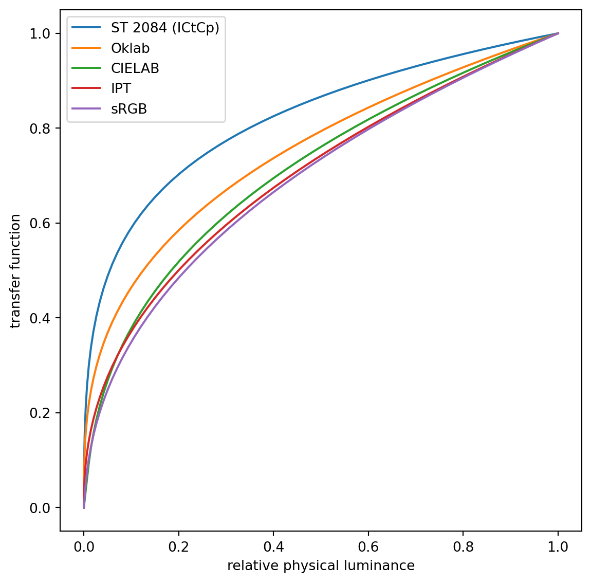
I found Björn’s arguments in favor of pure cube root to be not entirely compelling, but this is perhaps an open question. Both CIELAB and sRGB use a finite-derivative region near black. Is it important to limit derivatives for more accurate LUT-based calculation? Perhaps in 2021, we will almost always prefer ALU to LUT. The conditional part is also not ideal, especially on GPUs, where branches can hurt performance. I personally would explore transfer functions of the form $f(x) = a + (b + cx)^\gamma$, constrained so $f(0) = 0$ and $f(1) = 1$, as these are GPU-friendly and have smooth derivatives. The XYB color space used in JPEG XL apparently uses a bias rather than a piecewise linear region, as well. (Source: HN thread on Oklab, as I wasn’t easily able to find a document)
The Lab/IPT architecture
CIELAB, IPT, ICtCp, and Oklab all share a simple architecture: a 3x3 matrix, a nonlinear function, and another 3x3 matrix. In addition to being simple, this architecture is easily invertible. Many other color spaces are considerably more complex, with CIECAM as an especially bad offender.
The main difference between the various color spaces in this architecture is the nonlinear function, which determines the black-to-white ramp as discussed above. Once that is in place, there is a relatively small number of remaining parameters. Those can be optimized, either by hand or using an automated optimizer trying to minimize a cost function.
In particular, ICtCp was derived from the ST 2084 transfer function, and then optimized for hue linearity and good lightness prediction. It’s important to note, good lightness prediction in an HDR context does not mean that the lightness steps are perceptually uniform, but that colors with the same reported lightness have the same perceived lightness. ICtCp does well in the latter criterion, but not so much the former; it’s fundamentally in tension with a color space suitable for HDR.
Comparisons
Hue linearity
On hue linearity, my evaluation is that IPT, ICtCp, and Oklab are all quite good, and a huge improvement over CIELAB. This is not terribly surprising, as they are all optimized for hue linearity with respect to the Ebner-Fairchild data set, which is of very high quality.
Where does the shift in blue come from?
It’s always been a bit of a mystery to me why CIELAB has such a bad hue shift in the blue range. I think some of it is just bad tuning of the matrix parameters, but there is an even deeper issue. Additive mixing of deep blue and white creates a hue shift towards purple. James Clerk Maxwell would have been able to observe this in spinning top experiments, had he mixed a sufficiently strong blue; I’m not sure exactly when this was first noted.
More recent research indicates that changing the bandwidth of a gaussian spectrum, but retaining its peak wavelength, tends to change the perceived color saturation while retaining hue constancy. The authors of Using Gaussian Spectra to Derive a Hue-linear Color Space observe this and tries to use the fact to derive a hue-linear color space (very similar to IPT as well) from first principles, rather than experimental data. The results are mixed; the results are pretty good but not perfect, perhaps illustrating that an optimization process is always very sensitive to flaws in the optimization criterion. In any case, I found the paper to provide intuitive insight into why this problem is not so simple, and in particular why additive light mixing with neutral is not hue-preserving.
Lightness
On lightness, the Oklab blog argues more accurate predictions than IPT. I was initially skeptical of this claim (it’s not entirely consistent with similar claims in Ebner’s thesis, see Figures 69 and 71 in particular), but on closer examination I agree. The following images should help you verify this claim yourself:
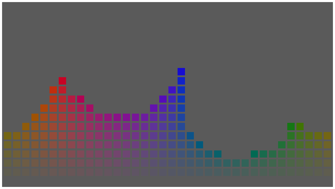
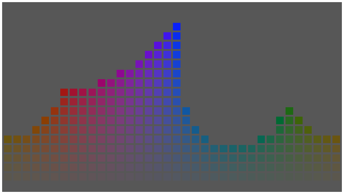
The first is a collection of color patches with the same lightness (I) value in IPT, and the second with the same lightness (L) in Oklab. To my eyes, the second has more uniform lightness, while in IPT blues are too dark and yellow-greens are too light.
It’s also possible to evaluate this claim objectively. The L* axis in CIELAB is widely agreed to predict lightness. Thus, deviations from it are a bad sign. The plots below show a scatterplot of random colors, with CIELAB L* on the horizontal axis, and the lightness axis of IPT and Oklab on the vertical axis:
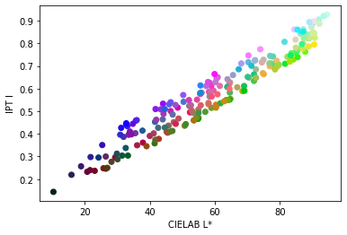
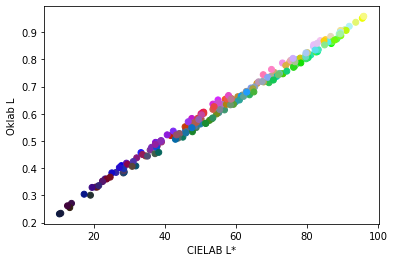
As can be seen, Oklab correlates much more strongly with CIELAB on the lightness scale, while IPT has considerable variation. I was also interested to see that ICtCp correlates strongly with CIELAB as well, though there’s a pronounced nonlinearity due to the transfer function.
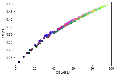
Differences in lightness don’t have a huge effect on gradients, but they do affect image processing operations such as changing saturation. Thus, I wouldn’t recommend IPT as a color space for these operations, and am more comfortable recommending Oklab.
Chroma
I didn’t evaluate this claim as carefully, in part because its relevance to high quality gradients is limited. Relative changes in chroma are of course very important, but the absolute chroma value ascribed to highly saturated colors matters little to gradients. Even so, the quantitative data suggest that Oklab is a more accurate predictor, and it’s easy to believe, as IPT wasn’t carefully optimized for this criterion.
Conclusions
A good perceptual color space can make higher quality, more uniform gradients. While CIELAB is popular and well-known, its hue shift is a problem. The original IPT color space was a great advancement: it has tremendously better hue constancy, while retaining the same simple structure. That said, its predictions of lightness and chroma are less highly tuned.
The desirable properties of IPT inspired a family of IPT-like color spaces, with the main difference being the choice of transfer function. Obviously the family includes ICtCp, which uses a transfer function optimized for HDR (but which, sadly, makes it less suitable for general purpose use). The modern recipe for an IPT-like color space is to choose a transfer function, then optimize the matrix parameters for hue linearity and accurate prediction of lightness and chroma. Oklab is basically the result of applying that recipe, starting at the cube-root transfer function.
For most applications where CIELAB is used today, both IPT and Oklab are better alternatives. The choice between them is a judgment call, though Oklab does have better prediction of chroma and lightness.
Is an even better color space possible? I think so. I personally would like to see a transfer function with a little more contrast in the near-black region (closer to CIELAB), but this is something of a judgment call. I also think it’s possible to optimize on the basis of higher quality data; indexing off an existing color space retains any flaws in that space. Perhaps the biggest concern is that there is no one clear contender for a post-CIELAB standard. Another spin on Oklab with even higher quality data, and a consensus-building process, could be exactly that.
In the meantime, I can highly recommend Oklab for tasks such as making better gradients.
This blog post benefitted greatly from conversations with Björn Ottson and Jacob Rus, though of course my mistakes are my own.
Discuss on Hacker News.
Update 2021-01-29
I’ve added several more color spaces to the widget above.
One of the color spaces is linear mixing, which doesn’t have great hue linearity, and is perceptually way too light in the white-black ramp. But I include it for comparison because some have suggested that it is appropriate for gradients.
Another great resource for “better gradients” is Matt Deslaurier’s gradient Observable notebook. That now has an open source license and a correct implementation of XYB.
XYB
The XYB color space is part of JPEG XL, and thus its main motivation is image compression. Its hue linearity is not great, about halfway between CIELAB and IPT. However, it has a nice transfer function - it’s a cube root with an offset, which has generally similar darkness/lightness as CIELAB, but with smoother derivatives throughout. If I were to make a new color space, I would choose this transfer function.
SRLAB2
A very little known color space is SRLAB2 by Jan Behrens. It uses the CIELAB transfer function but updates the matrices for better hue linearity. Overall it performs very well; the only flaw I found is that the red-white ramp bends toward orange (as does CIELAB).
Juha Järvi has produced a gist analyzing SRLAB2 in more detail, and there is some Reddit discussion as well. Thanks to Juha for bringing this to my attention.