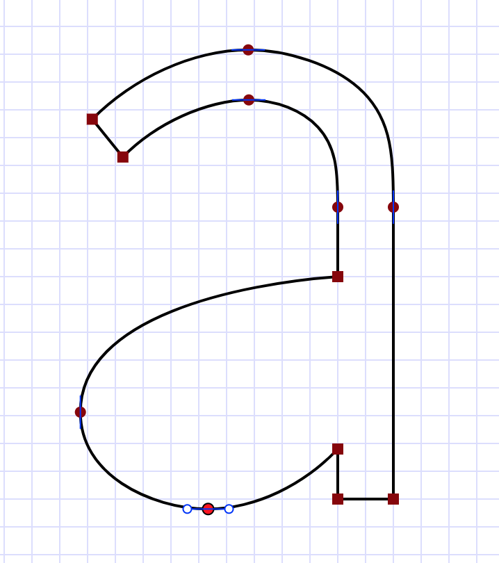
A new spline
I’ve been heads-down for the last month or so working on a new spline, and now I’m excited to show it to the world. It is a continuation of the Spiro work I did for my PhD thesis, and solves most of the problems that held that back from wider popularity.
For the impatient, click on the screenshot below to try the demo yourself.
Stability and robustness
One of the biggest problems with Spiro was that the underlying constraint system didn’t always have a unique solution. The solver would often fail to converge, making wild patterns reminiscent of particle accelerator tracks. That didn’t give the impression of a reliable tool; it felt like a rough research prototype.
The new spline solves this problem, smoothly going through cusps in the cases where Spiro would suddenly reverse the direction of loops. I was inspired by κ-Curves, the technology underlying the new “curvature tool” in Adobe Illustrator, which also uses cusps to achieve robustness (and, kindly enough, cites my work as an example of the problem it solves). The exact approach I used was more similar to [Hobby’s splines], originally designed for Metafont, and also uses cubic segments that somewhat approximate Euler spirals as the basic curve family.
More supple curves
Spiro basically optimized for the smallest possible curvature variance. This tendency to small curvature variation is similar to a stiff piece of spring steel, though the analogy isn’t perfect (for those wanting to understand what’s really going on, the details are in my thesis).
While it’s nice that you can make smooth curves, these stiff-spring curves are not the only ones artists and font designers draw. Sometimes you want more dramatic variations in curvature. The new spline follows the artist’s intent a lot more faithfully.
Explicit tangents and curvature blending
An extremely important feature for font design is smooth transitions from smooth to curved sections; if you just weld a curved section to a straight line, the transition is visible. Spiro was good at this, but had a very confusing UX, involving “one-way constraints.” It was easy to get those backwards, and then your curve would be all over the place.
The new spline solves this problem, but with a completely different approach to UX. Now you can set an explicit tangent on points, and when that lines up with a straight section, the curvature ramps up smoothly from zero at that point. You can see this on the right hand side of the “a” outline in the screenshot above.
More generally, when explicit tangents would cause curvature discontinuity, the new spline just adjusts curvature along the curve so that it matches at the control point (the curvature at that point is “blend” of the raw curvatures).
The net effect is more flexibility over the resulting shapes, intuitive control, and always smooth results (in the form of G2 continuity - if the artist wants to draw a lumpy line, there’s nothing preventing that).
A research prototype
The online demo is a research prototype, sparse in features and still with some rough edges. For example, I’m still fine-tuning the exact curve family, and believe I can get blending even smoother than it is now. But it’s good enough I wanted to share it with the world. The numerical methods aren’t perfect, and if you push it hard it’ll sometimes get a slightly wrong answer. It still can’t do multiple subpaths, so it can’t quite be used to draw font shapes (hence the lack of an inner subpath in the screenshot above), but I think it’s possible to start to get a feel with what I have now.
The code is in a research repo, and is in JavaScript with a GPL license. This is not the production code yet, which I intend to port to at least C++ so that it can be more easily integrated into existing font and vector curve editor codebases.
The repo contains a writeup of the spline itself, but I haven’t yet written up a good account of the curvature blending. That’s mostly because I just today got it working well enough that I felt confident sharing it.
I’m interested in licensing this spline. Ideally I’d be working with a partner who would be able to deliver a great user experience. I realize the rough research prototype needs refinement before it can be used in production, but I’m eager to do that, ideally customizing it for the specific needs. I think there’s potential in font design (my original motivation), vector artwork, info visualization, CAD, map rendering, and other areas. There are some discussions underway, and I’m open to more.
I also want people to play with this prototype, if for no other purpose than to advance the state of knowledge.
Acknowledgments
I’d like to thank Jacob Rus and Carlo Séquin for stimulating discussions during the development of this spline; they’ve both helped refine the ideas.
Discuss on Hacker News and Lobsters.
