Text layout is a loose hierarchy of segmentation
I love text layout, and have been working with it in one form or other for over 35 years. Yet, knowledge about it is quite arcane. I don’t believe there is a single place where it’s all properly written down. I have some explanation for that: while basic text layout is very important for UI, games, and other contexts, a lot of the “professional” needs around text layout are embedded in much more complicated systems such as Microsoft Word or a modern Web browser.
A complete account of text layout would be at least a small book. Since there’s no way I can write that now, this blog post is a small step towards that – in particular, an attempt to describe the “big picture,” using the conceptual framework of a “loose hierarchy.” Essentially, a text layout engine breaks the input into finer and finer grains, then reassembles the results into a text layout object suitable for drawing, measurement, and hit testing.
The main hierarchy is concerned with laying out the entire paragraph as a single line of text. Line breaking is also important, but has a separate, parallel hierarchy.
The main text layout hierarchy
The hierarchy is: paragraph segmentation as the coarsest granularity, followed by rich text style and BiDi analysis, then itemization (coverage by font), then Unicode script, and shaping clusters as the finest.

Paragraph segmentation
The coarsest, and also simplest, segmentation task is paragraph segmentation. Most of the time, paragraphs are simply separated by newline (U+000A) characters, though Unicode in its infinite wisdom specifies a number of code point sequences that function as paragraph separators in plain text:
- U+000A LINE FEED
- U+000B VERTICAL TAB
- U+000C FORM FEED
- U+000D CARRIAGE RETURN
- U+000D U+000A (CR + LF)
- U+0085 NEXT LINE
- U+2008 LINE SEPARATOR
- U+2009 PARAGRAPH SEPARATOR
In rich text, paragraphs are usually indicated through markup rather than special characters, for example <p> or <br> in HTML. But in this post, as in most text layout APIs, we’ll treat rich text as plain text + attribute spans.
Rich text style
A paragraph of rich text may contain spans that can affect formatting. In particular, choice of font, font weight, italic or no, and a number of other attributes can affect text layout. Thus, each paragraph is typically broken into a some number of style runs, so that within a run the style is consistent.
Note that some style changes don’t necessarily affect text layout. A classic example is color. Firefox, rather famously, does not define segmentation boundaries here for color changes. If a color boundary cuts a ligature, it uses fancy graphics techiques to render parts of the ligature in different color. But this is a subtle refinement and I think not required for basic text rendering. For more details, see Text Rendering Hates You.
Bidirectional analysis
Completely separate from the style spans, a paragraph may in general contain both left-to-right and right-to-left text. The need for bidirectional (BiDi) text is certainly one of the things that makes text layout more complicated.
Fortunately, this part of the stack is defined by a standard (UAX #9), and there are a number of good implementations. The interested reader is referred to Unicode Bidirectional Algorithm basics. The key takeaway here is that BiDi analysis is done on the plain text of the entire paragraph, and the result is a sequence of level runs, where the level of each run defines whether it is LTR or RTL.
The level runs and the style runs are then merged, so that in subsequent stages each run is of a consistent style and directionality. As such, for the purpose of defining the hierarchy, the result of BiDi analysis could alternatively be considered an implicit or derived rich text span.
In addition to BiDi, which I consider a basic requirement, a more sophisticated text layout engine will also be able to handle vertical writing modes, including mixed cases where short strings are horizontal within the vertical primary direction. Extremely sophisticated layout engines will also be able to handle ruby text and other ways of annotating the main text flow with intercalated strings. See Requirements for Japanese Text Layout for many examples of sophisticated layout requirements; the scope of this blog post really is basic text layout of the kind needed in user interfaces.
Itemization (font coverage)
Itemization is the trickiest and least well specified part of the hierarchy. There is no standard for it, and no common implementation. Rather, each text layout engine deals with it in its own special way.
Essentially, the result of itemization is to choose a single concrete font for a run, from a font collection. Generally a font collection consists of a main font (selected by font name from system fonts, or loaded as a custom asset), backed by a fallback stack, which are usually system fonts, but thanks to Noto it is possible to bundle a fallback font stack with an application, if you don’t mind spending a few hundred megabytes for the assets.
Why is it so tricky? A few reasons, which I’ll touch on.
First, it’s not so easy to determine whether a font can render a particular string of text. One reason is Unicode normalization. For example, the string “é” can be encoded as U+00E9 (in NFC encoding) or as U+0065 U+0301 (in NFD encoding). Due to the principle of Unicode equivalence, these should be rendered identically, but a font may have coverage for only one or the other in its Character to Glyph Index Mapping (cmap) table. The shaping engine has all the Unicode logic to handle these cases.
Of course, realistic fonts with Latin coverage will have both of these particular sequences covered in the cmap table, but edge cases certainly do happen, both in extended Latin ranges, and other scripts such as Hangul, which has complex normalization rules (thanks in part to a Korean standard for normalization which is somewhat at odds with Unicode). It’s worth noting that DirectWrite gets Hangul normalization quite wrong.
I believe a similar situation exists with the Arabic presentation forms; see Developing Arabic fonts for more detail on that.
Because of these tricky normalization and presentation issues, the most robust way to determine whether a font can render a string is to try it. This is how LibreOffice has worked for a while, and in 2015 Chromium followed. See also Eliminating Simple Text for more background on the Chromium text layout changes.
Another whole class of complexity is emoji. A lot of emoji can be rendered with either text or emoji presentation, and there are no hard and fast rules to pick one or the other. Generally the text presentation is in a symbol font, and the emoji presentation is in a separate color font. A particularly tough example is the smiling emoji, which began its encoding life as 0x01 in Code page 437, the standard 8-bit character encoding of the original IBM PC, and is now U+263A in Unicode. However, the suggested default presentation is text, which won’t do in a world which expects color. Apple on iOS unilaterally chose an emoji presentation, so many text stacks follow Apple’s lead. (Incidentally, the most robust way to encode such emoji is to append a variation selector to pin down the presentation.)
Another source of complexity when trying to write a cross-platform text layout engine is querying the system fonts. See Font fallback deep dive for more information about that.
I should note one thing, which might help people doing archaeology of legacy text stacks: it used to be pretty common for text layout to resolve “compatibility” forms such as NFKC and NFKD, and this can lead to various problems. But today it is more common to solve that particular problem by providing a font stack with massive Unicode coverage, including all the code points in the relevant compatibility ranges.
Script
The shaping of text, or the transformation of a sequence of code points into a sequence of positioned glyphs, depends on the script. Some scripts, such as Arabic and Devanagari, have extremely elaborate shaping rules, while others, such as Chinese, are a fairly straightforward mapping from code point into glyph. Latin is somewhere in the middle, starting with a straightforward mapping, but ligatures and kerning are also required for high quality text layout.
Determining script runs is reasonably straightforward - many characters have a Unicode script property which uniquely identifies which script they belong to. However, some characters, such as space, are “common,” so the assigned script just continues the previous run.
A simple example is “hello мир”. This string is broken into two script runs: “hello “ is Latn, and “мир” is Cyrl.
Shaping (cluster)
At this point, we have a run of constant style, font, direction, and script. It is ready for shaping. Shaping is a complicated process that converts a string (sequence of Unicode code points) into positioned glyphs. For the purpose of this blog post, we can generally treat it as a black box. Fortunately, a very high quality open source implementation exists, in the form of HarfBuzz.
We’re not quite done with segmentation, though, as shaping assigns substrings in the input to clusters of glyphs. The correspondence depends a lot on the font. In Latin, the string “fi” is often shaped to a single glyph (a ligature). For complex scripts such as Devanagari, a cluster is most often a syllable in the source text, and complex reordering can happen within the cluster.
Clusters are important for hit testing, or determining the correspondence between a physical cursor position in the text layout and the offset within the text. Generally, they can be ignored if the text will only be rendered, not edited (or selected).
Note that these shaping clusters are distinct from grapheme clusters. The “fi” example has two grapheme clusters but a single shaping cluster, so a grapheme cluster boundary can cut a shaping cluster. Since it’s possible to move the cursor between the “f” and “i”, one tricky problem is to determine the cursor location in that case. Fonts do have a caret table, but implementation is spotty. A more robust solution is to portion the width of the cluster equally to each grapheme cluster within the cluster. See also Let’s Stop Ascribing Meaning to Code Points for a detailed dive into grapheme clusters.
Line breaking
While short strings can be considered a single strip, longer strings require breaking into lines. Doing this properly is quite a tricky problem. In this post, we treat it as a separate (small) hierarchy, parallel to the main text layout hierarchy above.
The problem can be factored into identifying line break candidates, then choosing a subset of those candidates as line breaks that satisfy the layout constraints. The main constraint is that lines should fit within the specified maximum width. It’s common to use a greedy algorithm, but high end typography tends to use an algorithm that minimizes a raggedness score for the paragraph. Knuth and Plass have a famous paper, Breaking Paragraphs into Lines, that describes the algorithm used in TeX in detail. But we’ll focus on the problems of determining candidates and measuring the widths, as these are tricky enough.
In theory, the Unicode Line Breaking Algorithm (UAX #14) identifies positions in a string that are candidate line breaks. In practice, there are some additional subtleties. For one, some languages (Thai is the most common) don’t use spaces to divide words, so need some kind of natural language processing (based on a dictionary) to identify word boundaries. For two, automatic hyphenation is often desirable, as it fills lines more efficiently and makes the right edge less ragged. Liang’s algorithm is most common for automatically inferring “soft hyphens,” and there are many good implementations of it.
Android’s line breaking implementation (in the Minikin library) applies an additional refinement: since email addresses and URLs are common in strings displayed on mobile devices, and since the UAX #14 rules give poor choices for those, it has an additional parser to detect those cases and apply different rules.
Finally, if words are very long or the maximum width is very narrow, it’s possible for a word to exceed that width. In some cases, the line can be “overfull,” but it’s more common to break the word at the last grapheme cluster boundary that still fits inside the line. In Android, these are known as “desperate breaks.”
So, to recap, after the paragraph segmentation (also known as “hard breaks”), there is a loose hierarchy of 3 line break candidates: word breaks as determined by UAX #14 (with possible “tailoring”), soft hyphens, and finally grapheme cluster boundaries. The first is preferred, but the other two may be used in order to satisfy the layout constraints.
This leaves another problem, which is suprisingly tricky to get fully right: how to measure the width of a line between two candidate breaks, in order to validate that it fits within the maximum width (or, in the more general case, to help compute a global raggedness score). For Latin text in a normal font, this seems almost ridiculously easy: just measure the width of each word, and add them up. But in the general case, things are nowhere nearly so simple.
First, while in Latin, most line break candidates are at space characters, in the fully general case they can cut anywhere in the text layout hierarchy, even in the middle of a cluster. An additional complication is that hyphenation can add a hyphen character.
Even without hyphenation, because shaping is Turing Complete, the width of a line (a substring between two line break candidates) can be any function. Of course, such extreme cases are rare; it’s most common for the widths to be exactly equal to the sum of the widths of the words, and even in the other cases this tends to be a good approximation.
So getting this exactly right in the general case is conceptually not difficult, but is horribly inefficient: for each candidate for the end of the line, perform text layout (mostly shaping) on the substring from the beginning of the line (possibly inserting a hyphen), and measure the width of that layout.
Very few text layout engines even try to handle this general case, using various heuristics and approximations which work well most of the time, but break down when presented with a font with shaping rules that change widths aggressively. DirectWrite does, however, using very clever techniques that took several years of iteration. The full story is in harfbuzz/harfbuzz#1463 (comment). Further analysis, towards a goal of getting this implemented in an open source text layout engine, is in yeslogic/allsorts#29. If and when either HarfBuzz or Allsorts implements the lower-level logic, I’ll probably want to write another blog post explaining in more detail how a higher level text layout engine can take advantage of it.
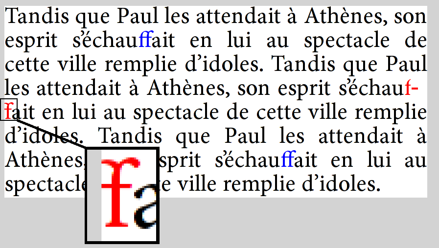
A great example of how line breaking can go wrong is Firefox bug 479829, in which an “f + soft hyphen + f” sequence in the text is shaped as the “ff” ligature, then the line is broken at the soft hyphen. Because Firefox reuses the existing shaping rather than reshaping the line, it actually renders with the ligature glyph split across lines:
Implementations to study
While I still feel a need for a solid, high-level, cross-platform text layout engine, there are good implementations to study. In open source, on of my favorites (though I am biased), is the Android text stack, based on Minikin for its lower levels. It is fairly capable and efficient, and also makes a concerted effort to get “all of Unicode” right, including emoji. It is also reasonably simple and the code is accessible.
While not open source, DirectWrite is also well worth study, as it is without question one of the most capable engines, supporting Word and the previous iteration of Edge before it was abandonded in favor of Chromium. Note that there is a proposal for a cross-platform implementation and also potentially to take it open-source. If that were to happen, it would be something of a game changer.
Chromium and Firefox are a rich source as well, especially as they’ve driven a lot of the improvements in HarfBuzz. However, their text layout stacks are quite complex and do not have a clean, documented API boundary with the rest of the application, so they are not as suitable for study as the others I’ve chosen here.
Android
Paragraph and style segmentation (with BiDi) is done at higher levels, in Layout.java and StaticLayout.java. At that point, runs are handed to Minikin for lower-level processing. Most of the rest of the hierarchy is in Layout.cpp, and ultimately shaping is done by HarfBuzz.
Minikin also contains a sophisticated line breaking implementation, including Knuth-Plass style optimized breaking.
Android deals with shaping boundaries by using heuristics to further segment the text to implied word boundaries (which are also used as the grain for layout cache). If a font does shaping across these boundaries, the shaping context is simply lost. This is a reasonable compromise, especially in mobile, as results are always consistent, ie the width for measurement never mismatches the width for layout. And none of the fonts in the system stack have exotic behavior such as shaping across spaces.
Android does base its itemization on cmap coverage, and builds sophisticated bitmap structures for fast queries. As such, it can get normalization issues wrong, but overall this seems like a reasonable compromise. In particular, most of the time you’ll run into normalization issues is with Latin and the combining diacritical marks, both of which are supplied by Roboto, which in turn has massive Unicode coverage (and thus less need to rely on normalization logic). But with custom fonts, handling may be less than ideal, resulting in more fallback to Roboto than might actually be needed.
Note that Minikin was also the starting point for libTxt, the text layout library used in Flutter.
DirectWrite
Some notes on things I’ve found while studying the API; these observations are quite a bit in the weeds, but might be useful to people wanting to deeply understand or engage the API.
Hit testing in DirectWrite is based on leading/trailing positions, while in Android it’s based on primary and secondary. The latter is more useful for text edition, but leading/trailing is a more well-defined concept (for one, it doesn’t rely on paragraph direction). For more information on this topic, see linebender/piet#323. My take is that proper hit testing requires iterating through the text layout to access lower level structures.
While Core Text (see below) exposes a hierarchy of objects, DirectWrite uses the TextLayout as the primary interface, and exposes internal structure (even including lines) by iterating over a callback per run in the confusingly named Draw method. The granularity of this callback is a glyph run, which corresponds to “script” in the hierarchy above. Cluster information is provided in an associated glyph run description structure.
There are other ways to access lower level text layout capabilities, including TextAnalyzer, which computes BiDi and line break opportunities, script runs, and shaping. In fact, the various methods on that interface represents much of the internal structure of the text layout engine. Itemization, however, is done in the FontFallback interface, which was added later.
Core Text
Another high quality implementation is Core Text. I don’t personally find it as well designed as DirectWrite, but it does get the job done. In general, though, Core Text is considered a lower level interface, and applications are recommended to use a higher level mechanism (Cocoa text on macOS, Text Kit on iOS).
When doing text layout on macOS, it’s probably better to use the platform-provided itemization method (CTFontCreateForString), rather than getting the font list and doing itemization in the client. See linebender/skribo#14 for more information on this tradeoff.
Druid/Piet
At this point, the Druid GUI toolkit does not have its own native text layout engine, but rather does provide a cross-platform API which is delegated to platform text layout engines, DirectWrite and Core Text in particular.
The situation on Linux is currently unsatisfactory, as it’s based on the Cairo toy text API. There is work ongoing to improve this, but no promises when.
While the Piet text API is currently fairly basic, I do think it’s a good starting point for text layout, especially in the Rust community. While the complexity of Web text basically forces browsers to do all their text layout from scratch, for UI text there are serious advantages to using the platform text layout capabilities, including more consistency with native UI, and less code to compile and ship.
Pango
I should at least mention Pango, which provides text layout capabilities for Gtk and other software. It is open source and has a long history, but is more focused on the needs of Linux and in my opinion is less suitable as a cross-platform engine, though there is porting work for both Windows and macOS. As evidence it hasn’t been keeping quite up to date, the Windows integration is all based on GDI+ rather than the more recent Direct2D and DirectWrite, so capabilities are quite limited by modern standards.
The question of level
A consistent theme in the design of text level APIs is: what level? Ideally the text layout engine provides a high level API, meaning that rich text (in some concrete representation) comes in, along with the fonts, and a text layout object comes out. However, this is not always adequate.
In particular, word processors and web browsers have vastly more complex layout requirements than can be expressed in a reasonable “attributed string” representation of rich text. For these applications, it makes sense to break apart the task of text layout, and provide unbundled access to these lower levels. Often, that corresponds to lower levels in the hierarchy I’ve presented. A good choice of boundary is style runs (including BiDi), as it simiplifies the question of rich text representation; expressing the style of a single run is simpler than a data structure which can represent all formatting requirements for the rich text.
Until more recently, web browsers tended to use platform text capabilities for the lower levels, but ultimately they needed more control, so for the most part, they do all the layout themselves, deferring to the platform only when absolutely necessary, for example to enumerate the system fonts for fallback.
The desire to accommodate both UI and browser needs motivated the design of the skribo API, and explains why it only handles single style runs. Unfortunately, the lack of a complementary high level driver proved to be quite a mistake, as there was no easy way for applications to use the library. We will be rethinking some of these decisions in coming months.
Other resources
A book in progress on text layout is Fonts and Layout for Global Scripts by Simon Cozens. There is more emphasis on complex script shaping and fonts, but touches on some of the same concepts as here.
Another useful resources is Modern text rendering with Linux: Overview, which has a Linux focus and explains Pango in more detail. It also links the SIGGRAPH 2018 - Digital typography slide deck, which is quite informative.
Thanks to Chris Morgan for review and examples.